Japan-inspired display font in TTF and OTF
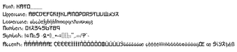
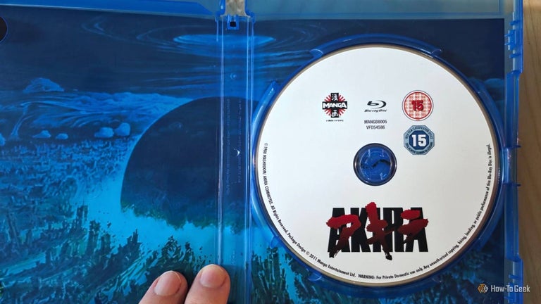
Kato, designed by Keith Bates of K-Type, is a stylized, Japan-inspired typeface intended for decorative display work. It presents bold, geometric letterforms and an angular, techno-tinged motif that designers apply to short, attention-grabbing text such as posters and branding marks. The font targets graphic designers and typographers who need a distinct, non-Latin inspired display face for themed layouts and visual identity projects.
What Kato adds to a design toolkit
Kato is a decorative display face whose visual language references East Asian character forms while remaining a Latin typeface. The name pays tribute to the Pink Panther character Kato and the design dates to the early 2000s. Its usage pattern centers on headline and logo work rather than running text, and it has accrued notable exposure with over 200,000 downloads on major font repositories.
How much control you get over typographic texture
The font uses a dual-design approach in which uppercase and lowercase were conceived as separate, compatible sets, so designers can experiment with mixed-case layouts for texture. This dual logic makes it practical to create layered or alternating-letter effects without combining multiple families. The family contains 272 defined characters and 261 unique glyphs, which defines the scope of ornament and symbol choices available to a project.
Platform compatibility and file formats
Kato distributes as standard desktop font files, supplied in both TrueType (TTF) and OpenType (OTF) formats, so it installs into common design tools and word processors. Installation follows typical desktop steps: extract the ZIP, locate the .ttf or .otf file, then install from the file menu or right-click context menu. The face is usable on Windows, macOS, and Linux without additional converters.
Practical and licensing considerations for designers
The DaFont copy is marked for personal use only; commercial rights are handled through the K-Type foundry and its licensing terms. K-Type is an independent UK foundry known for offering many display faces with clear desktop licensing routes. Because the face intentionally mimics non-Latin forms, designers should treat it as a stylistic device rather than a substitute for native scripts in culturally sensitive applications.
A distinct display option with specific use cases
Kato is a purposeful choice for designers who need a stylized, geometric Latin display that evokes East Asian letterforms; it performs best in short, large-size text and branding marks. Designers should preview the face at final output sizes and pair it with neutral body faces to preserve legibility, and confirm appropriate commercial rights at the foundry before using it in client work.